Legibility of calligraphy as an art form
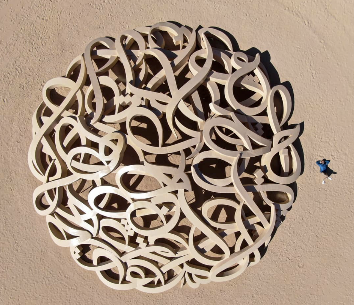
El Seed, "Mirage", 2020
When thinking about calligraphy, legibility is often an issue to be considered. After all, letters are primarily functional. As such, illegible letters fail at what they are supposed to do: conveying a message. That thought makes a lot of sense, and looking at traditional calligraphy, we often find very legible works.
But then, there is an entire body of works, by great artists, in which legibility seems to play a secondary, if any, role. If we take a look at the works of Hassan Massoudy, you’ll notice that you may be able to read some of his works [if you read Arabic], but legibility seems to not be at the forefront of his concerns when drawing. In the case of El Seed, it seems to be even harder to find specific words in his works. I sometimes wonder if he used specific words in the first place. Looking at Latin letter calligraphy, Nils “Shoe” Meulman would be a perfect example of a calligrapher who will often abandon legibility altogether.

Nils “Shoe” Meulman, BEYOND THE STREETS, Los Angeles, 2018
Needless to mention that all three are some of the most influential calligraphers of our time.
So what makes calligraphy artists, people who dedicate their whole life and creativity to letters, abandon the most basic function of these letters?
I believe that more often than not, it is the quest for expression that makes works of calligraphy become less legible than a printed book.
After all, calligraphy is more than just letters. It is art, using letters as “pixels”. And art wants to be expressive. If we put aside “popular” calligraphy, and focus on the works of people whose quest it is not to simply write beautifully, but rather to create art from letters, we’ll find ourselves confronted with a tension: the tension between legibility on one hand and expression and creativity on the other. Any piece of calligraphy is located somewhere on that line.

legibility vs expressiveness
If I draw a tattoo for a person who just went through a rough time and is looking for a touchstone, something to remind them of their strength to overcome this time, to grow stronger and to find peace, and if that person feels that their ancestry, their Jewish history and roots are a ground they can stand on, I may find myself drawing a project with the words Had I not fallen, I would not have arisen. Had I not been subject to darkness, I could not have seen the light, from Micah. I may want to “pour” these words into the form of a phoenix, symbolizing the power of renewal within that person.
Inevitably, I’ll find myself in the midst of that above mentioned tension between legibility and expression. On one hand, the most legible form those words can take is exactly the way they are written in a Hebrew bible. Black on white paper, in a straight line. On the other hand, the most detailed and expressive phoenix doesn’t include any of the Hebrew letters. It may be an oil painting with rough strokes and a fiery background.

A phoenix
It is the marriage between the two that makes creative calligraphy possible. And like any marriage, it demands concessions from both parties.
The letters may have to give up some of their straight lines. Some words may have to be stretched. Connections between words may have to be separated. On the other hand, the imaginary phoenix on oil I mentioned may have to give up on some of the flames it was born from. Some of the feathers may have to make space for the sharp lines of a Lamed or an Aleph. And its wide open eye may have to be depicted by a single Yud, leaving a lot for the viewer’s imagination.

The result is always an abstraction from both the text and the image. A calligram, a depictive calligraphy work, will always be more abstract than the image I had in mind when sharpening my pencil for the first time. And it will always be an abstraction of that straight line of letters we found in the book of Micah.

Micah 7: Had I not fallen, I would not have arisen. Had I not been subject to darkness, I could not have seen the light
What we gained in exchange for what we gave up is a depth of a work rich in layers and new connections and references. In a way, we can see it as the synthesis, born of the thesis of the printed sentence and the antithesis of the initially imagined phoenix.
In way of conclusion I’d like to mention that there is no universal sweet spot on that line between legibility and expression/creativity. Each work demands a new assessment of what should be preserved and what can be given up. The only thing that can never happen is a perfectly legible work which at the same time is anything but the pure, naked text.